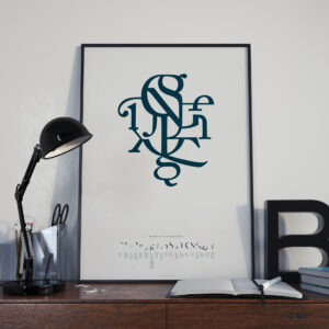
All letterforms are composed of twenty-one distinct parts.
Suzanne Cerja, Silo Design
Most commonly, these parts combine to form the characters of our alphabet.
Type is Art allows for experimentation beyond this typical character set.
I was not always a “typography nerd.” Maybe by some standards I’m still not. There is a point in my career that I can recall fairly vividly as the period when my eyes opened a bit more to the beauty and precision of the typographical form. This was the more or less at the moment when I was introduced to “The Elements of Typographic Style” by Robert Bringhurst, a book which most graphic designers would consider the gold standard of typography. Bringhurst delves into the history, forms, and uses of type with beautiful prose and clear illustrations. If you’ve never read or thumbed through this book I highly recommend it.

There is a high probability that I would never have come across this book were it not for the influence of a couple of friends, one of whom was a co-worker at an interactive design studio in New York’s Silicone Alley, that nexus of the city which is directly pointed at by the Flatiron Building and fed oxygen by Madison Square Park. I’ll note that this was in the early nineties and the neighborhood had not received it’s microchip inspired monicker yet – it was simply The Flatiron District. This is where I met Terje Vist and his partner Suzanne Cerja, both of whom were and continue to be art directors and designers of the highest caliber. Terje was in charge of making the interactive designs we created look good and communicate well. I was in charge of making these designs move and react to the end-users’ input, navigating the information and imagery being conveyed by whatever digital medium was available, mostly CD-Rom at the time. Suzanne was keeping the home fires burning and building Silo Design.
Type Is Art is a public interactive art project co-created by the three of us as an inspired labor of love that took on a life of its own. While the original piece was created in Flash, which no longer rules the web, the data for the user-generated designs and the source-code for the engine still exist and may see the light of day again in the future. Just writing this post is making me want to dig it all up and get it up and running. No small task, but so worthy of my time.
This typographic exploration tool is based on Susanne Cerha’s poster “Parts Of A Character” which beautifully illustrates the twenty-one simple forms which make up every character of our alphabet. The poster also features an abstract design created from these forms that is distinctly not a character of our alphabet. The impact of this poster along with my love for typography inspired me with such possibilities and led me to create a little Flash experiment where one could move these “parts of a character” around the screen and reconfigure them into new designs. I shared this with Terje, who shared it with Susanne, and by the end of 2001 the website and public art installation known as Type is Art was born.
Since its inception Type Is Art has been featured in numerous blogs and publications including PRINT magazine. It has been shown in art galleries, during an international typography conference, and used as an educational tool. Contributors to the database of designs include students, curious passers by, and well known designers. It is rumored that Austrian designer and typographic kingpin Stefan Sagmeister created one or two designs during the Typecon conference in Buffalo, New York. At last count there were over 20,000 user-generated designs created with Type is Art.
I will update this post once Type is Art has been revived. Until then please enjoy some photos, video, and a small collection of the images created by our collaborators.