Type is Art: Parts of a Character

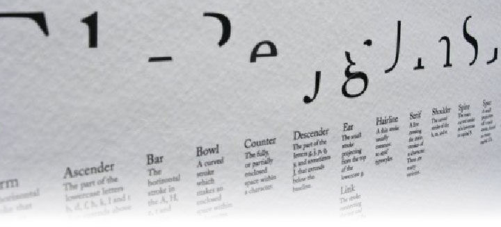
Parts of a Character print image showing the various shapes that compose the characters in our alphabet.

All letterforms are composed of twenty-one distinct parts.
Most commonly, these parts combine to form the characters of our alphabet.
Type is Art allows for experimentation beyond this typical character set.

Suzanne Cerja, Silo Design

I was not always a “typography nerd.” Maybe by some standards I’m still not. There is a point in my career that I can recall fairly vividly as the period when my eyes opened a bit more to the beauty and precision of the typographical form. This was the more or less at the moment when I was introduced to “The Elements of Typographic Style” by Robert Bringhurst, a book which most graphic designers would consider the gold standard of typography. Bringhurst delves into the history, forms, and uses of type with beautiful prose and clear illustrations. If you’ve never read or thumbed through this book I highly recommend it.

Parts of a Character by Susanne Cerja

There is a high probability that I would never have come across this book were it not for the influence of a couple of friends, one of whom was a co-worker at an interactive design studio in New York’s Silicone Alley, that nexus of the city which is directly pointed at by the Flatiron Building and fed oxygen by Madison Square Park. I’ll note that this was in the early nineties and the neighborhood had not received it’s microchip inspired monicker yet – it was simply The Flatiron District. This is where I met Terje Vist and his partner Suzanne Cerja, both of whom were and continue to be art directors and designers of the highest caliber. Terje was in charge of making the interactive designs we created look good and communicate well. I was in charge of making these designs move and react to the end-users’ input, navigating the information and imagery being conveyed by whatever digital medium was available, mostly CD-Rom at the time. Suzanne was keeping the home fires burning and building Silo Design.

Type Is Art is a public interactive art project co-created by the three of us as an inspired labor of love that took on a life of its own. While the original piece was created in Flash, which no longer rules the web, the data for the user-generated designs and the source-code for the engine still exist and may see the light of day again in the future. Just writing this post is making me want to dig it all up and get it up and running. No small task, but so worthy of my time.

This typographic exploration tool is based on Susanne Cerha’s poster “Parts Of A Character” which beautifully illustrates the twenty-one simple forms which make up every character of our alphabet. The poster also features an abstract design created from these forms that is distinctly not a character of our alphabet. The impact of this poster along with my love for typography inspired me with such possibilities and led me to create a little Flash experiment where one could move these “parts of a character” around the screen and reconfigure them into new designs. I shared this with Terje, who shared it with Susanne, and by the end of 2001 the website and public art installation known as Type is Art was born.

Since its inception Type Is Art has been featured in numerous blogs and publications including PRINT magazine. It has been shown in art galleries, during an international typography conference, and used as an educational tool. Contributors to the database of designs include students, curious passers by, and well known designers. It is rumored that Austrian designer and typographic kingpin Stefan Sagmeister created one or two designs during the Typecon conference in Buffalo, New York. At last count there were over 20,000 user-generated designs created with Type is Art.

I will update this post once Type is Art has been revived. Until then please enjoy some photos, video, and a small collection of the images created by our collaborators.

Continue Reading

I AM, No Self : Redux

Photo of Projected Artwork in Gallery
The original “I AM, No Self” on view at SP@CE224 Gallery, 2010.

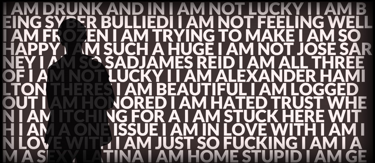
Back in 2010 I had the internet ask itself, “Who am I?” – “I AM, No Self” was the response. A digital art project which looks at identity and egolessness through the lens of social media, the project began as a personal contemplation. Born of my meditation practice it was shown for the first time in March of 2010 at the SP@CE224 Gallery in Buffalo, New York. The piece was part of a show themed around the concept of identity.

Back in 2010 I had the internet ask itself,
“Who am I?”

In a way this piece looks at our collective consciousness gathered by social media and asks of it the question, “Who am I?” The response is an endless stream of truncated self-identifying statements spanning the from mundane to the heartbreaking. When viewed in a gallery setting this work is taken to another level as the viewer, standing on a platform or otherwise marked space, blocks out part of the projection; their own silhouette carving out an area that is non-self identifying.

Initially the viewer may be overwhelmed by the endless flow of this collective mind-stream but it is my hope that in the space of a minute or two, the smooth and rhythmic pace of the animation, in concert with the gap visible in their shadow, will both relax and awaken the viewer to feelings of joy, compassion, kinship, and ultimately liberation.

Photo of Projected Artwork (2)
The original “I AM, No Self” on view at SP@CE224 Gallery, 2010.

Originally created in Adobe Flash, I recently reprogrammed it in using HTML5, allowing it to be viewed in modern browsers as well as on tablets, phones, and other mobile devices. While the personal screen experience is less impactful than being there I think it is worth sharing online.

It is my hope to show this piece in public again, perhaps projected at a larger scale for a wider audience.

View the project online at http://iamnoself.me


Continue Reading